Animating a wind turbine icon with Tailwind CSS
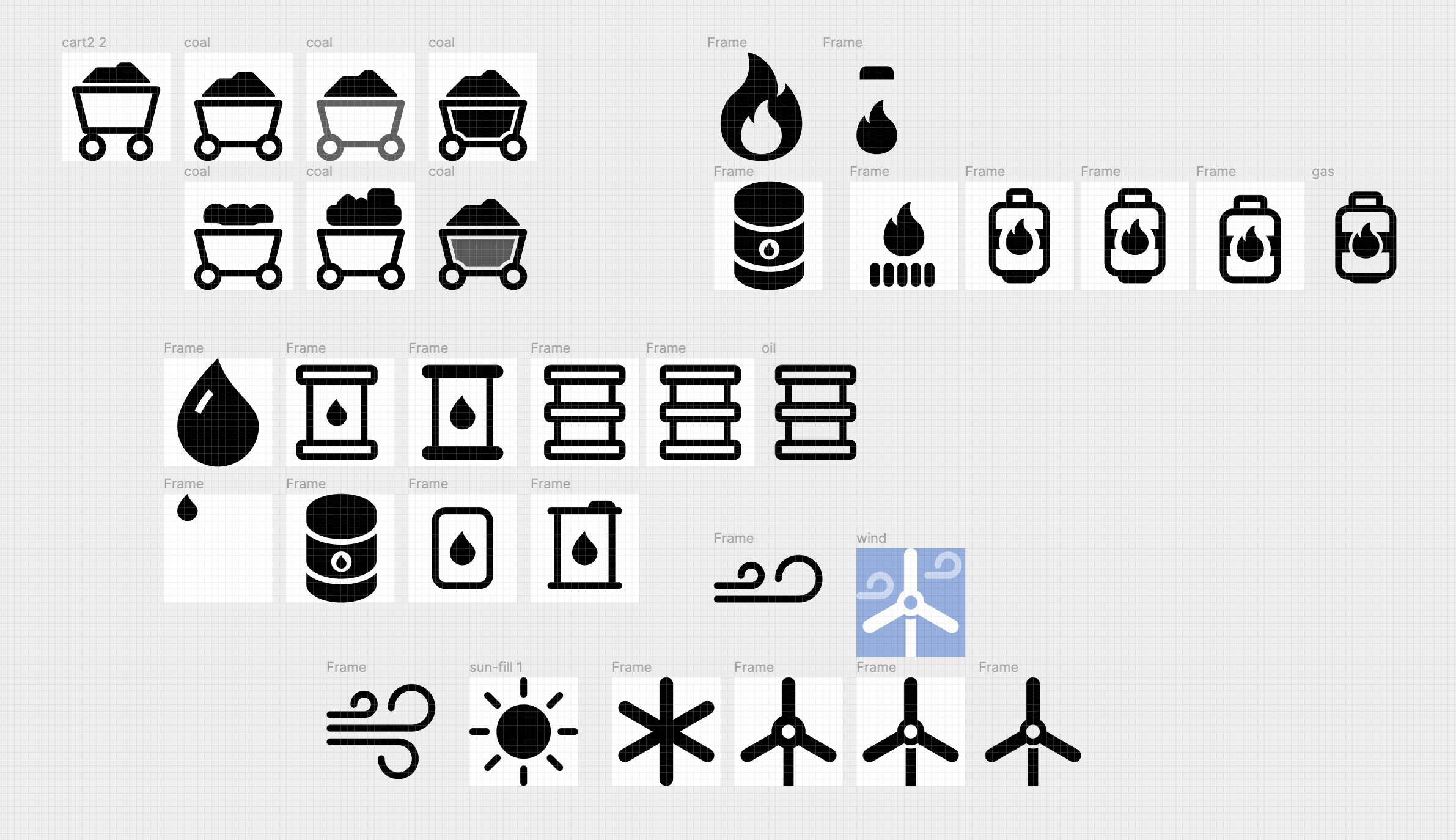
For an upcoming project, I needed icons for various power sources. I haven’t found a set of open source icons covering energy transition-related objects that’s consistent & high-quality, so for this game I’ve made my own. I started by using Bootstrap Icons—one of my favorite open source sets—but for wind, coal, & gas wanted to make custom ones. I’ve done icon design for Supercons before, which taught me a ton (such as how time-consuming & labor-intensive making these simple shapes is), but these icons needed more custom components than recycling existing pieces from other icons. Here’s my process of designing the set, in Figma. Get the Figma icons file here.
I went overboard with my implementation of the icons, adding a microinteraction for hovering the wind turbine to spin its blades. In the process, I leveled up my Tailwind CSS skills, so wanted to document how it works here.
For my first try, three parts were needed.
- I had a
<g>(SVG group element) around the turbine paths. I added thehover:animate-spinclass, which applied the animation on hover. - The animation needed to proceed more slowly. I discovered Tailwind CSS’s arbitrary values feature, which lets you add extra CSS properties by removing whitespace & enclosing it in brackets. Jamie Kyle suggested using
hover:[animation-duration:3s]to solve this. - By default, SVG elements only see hover events when you’re hovering the visibly-painted area, but because that area is moving due to the animation, it will animate away from your cursor, stopping the
:hoverstyles (the animation). This makes it stutter constantly. Thepointer-events: bounding-box;CSS declaration extends pointer events to the square container the paths are in, instead of the visibly-painted area, so if you’re hovering anywhere on the blades the animation will apply. so the class[pointer-events:bounding-box]adds that CSS. - The default origin for CSS transforms (such as rotation) is the upper left, but wind turbines spin around their center. The
origin-centerclass (CSStransform-origin: center) fixes that, making it look physically accurate.
Classes for the turbine <g> for this implementation: hover:animate-spin hover:[animation-duration:3s] origin-center [pointer-events:bounding-box].
While this worked well enough, I wanted the animation to run when you were hovering anywhere on the icon, not only on the blades. While this is easy in CSS, it’s not obvious for utility classes. Luckily, Tailwind’s hover groups fix this problem: you put the class group on the parent SVG, then on the child element (the <g> wrapping the blades), group-hover:animate-spin.
I discovered you can chain multiple prefixes in Tailwind, e.g. motion-safe:hover: as a prefix for @media (prefers-reduced-motion: no-preference) { element:hover {} } (read here if you haven’t used that media query before). This allowed the class name motion-safe:group-hover:animate-spin, which applies my animation to the blades when the parent element is hovered if the user wants motion.
In the end, the parent SVG has the class group, then the blades <g> element has the class motion-safe:group-hover:animate-spin motion-safe:group-hover:[animation-duration:3s] origin-center, and the animation works flawlessly! (Not in Safari, unfortunately, which has different behaviors around <g> hovering that bite me on every SVG project.)
Play with the demo on Tailwind’s editor
Here’s the final icon component in React:
export function IconWind({ size }) {return (<svgwidth={size}height={size}viewBox="0 0 16 16"className="group"xmlns="http://www.w3.org/2000/svg"><g className="motion-safe:group-hover:animate-spin motion-safe:group-hover:[animation-duration:3s] origin-center"><pathd="M8 0C8.26522 0 8.51957 0.105357 8.70711 0.292893C8.89464 0.48043 9 0.734784 9 1V6.268H7V1C7 0.734784 7.10536 0.48043 7.29289 0.292893C7.48043 0.105357 7.73478 0 8 0Z"fill="white"/><pathd="M7 9.732L2.438 12.366C2.32423 12.4327 2.19839 12.4762 2.06773 12.4941C1.93706 12.512 1.80415 12.5038 1.67665 12.4701C1.54915 12.4364 1.42958 12.3778 1.32482 12.2977C1.22006 12.2176 1.13218 12.1175 1.06624 12.0033C1.00029 11.8891 0.957596 11.763 0.940597 11.6322C0.923599 11.5014 0.932636 11.3686 0.96719 11.2413C1.00174 11.114 1.06113 10.9949 1.14193 10.8906C1.22273 10.7864 1.32335 10.6992 1.438 10.634L6 8L7 9.732Z"fill="white"/><pathd="M10 8L14.562 10.634C14.6766 10.6992 14.7773 10.7864 14.8581 10.8906C14.9389 10.9949 14.9983 11.114 15.0328 11.2413C15.0674 11.3686 15.0764 11.5014 15.0594 11.6322C15.0424 11.763 14.9997 11.8891 14.9338 12.0033C14.8678 12.1175 14.7799 12.2176 14.6752 12.2977C14.5704 12.3778 14.4508 12.4364 14.3233 12.4701C14.1958 12.5038 14.0629 12.512 13.9323 12.4941C13.8016 12.4762 13.6758 12.4327 13.562 12.366L9 9.732L10 8Z"fill="white"/><circle cx="8" cy="8" r="1.5" stroke="white" fill="none" /></g><pathfillRule="evenodd"clipRule="evenodd"d="M7.25 10.3855V16H8.75V10.3855C8.51324 10.4599 8.2613 10.5 8 10.5C7.7387 10.5 7.48676 10.4599 7.25 10.3855Z"fill="white"/><pathd="M2.79289 4.79289C2.98043 4.60536 3.23478 4.5 3.5 4.5C3.76522 4.5 4.01957 4.60536 4.20711 4.79289C4.39464 4.98043 4.5 5.23478 4.5 5.5C4.5 5.76522 4.39464 6.01957 4.20711 6.20711C4.01957 6.39464 3.76522 6.5 3.5 6.5H0.5C0.367392 6.5 0.240215 6.55268 0.146447 6.64645C0.0526784 6.74022 0 6.86739 0 7C0 7.13261 0.0526784 7.25979 0.146447 7.35355C0.240215 7.44732 0.367392 7.5 0.5 7.5H3.5C3.89556 7.5 4.28224 7.3827 4.61114 7.16294C4.94004 6.94318 5.19638 6.63082 5.34776 6.26537C5.49913 5.89992 5.53874 5.49778 5.46157 5.10982C5.3844 4.72186 5.19392 4.36549 4.91421 4.08579C4.63451 3.80608 4.27814 3.6156 3.89018 3.53843C3.50222 3.46126 3.10009 3.50087 2.73463 3.65224C2.36918 3.80362 2.05682 4.05996 1.83706 4.38886C1.6173 4.71776 1.5 5.10444 1.5 5.5C1.5 5.63261 1.55268 5.75979 1.64645 5.85355C1.74021 5.94732 1.86739 6 2 6C2.13261 6 2.25979 5.94732 2.35355 5.85355C2.44732 5.75979 2.5 5.63261 2.5 5.5C2.5 5.23478 2.60536 4.98043 2.79289 4.79289Z"fill="white"fillOpacity={0.5}/><pathd="M12.7929 1.79289C12.9804 1.60536 13.2348 1.5 13.5 1.5C13.7652 1.5 14.0196 1.60536 14.2071 1.79289C14.3946 1.98043 14.5 2.23478 14.5 2.5C14.5 2.76522 14.3946 3.01957 14.2071 3.20711C14.0196 3.39464 13.7652 3.5 13.5 3.5H10.5C10.3674 3.5 10.2402 3.55268 10.1464 3.64645C10.0527 3.74022 10 3.86739 10 4C10 4.13261 10.0527 4.25979 10.1464 4.35355C10.2402 4.44732 10.3674 4.5 10.5 4.5H13.5C13.8956 4.5 14.2822 4.3827 14.6111 4.16294C14.94 3.94318 15.1964 3.63082 15.3478 3.26537C15.4991 2.89992 15.5387 2.49778 15.4616 2.10982C15.3844 1.72186 15.1939 1.36549 14.9142 1.08579C14.6345 0.806082 14.2781 0.615601 13.8902 0.53843C13.5022 0.46126 13.1001 0.500867 12.7346 0.652242C12.3692 0.803617 12.0568 1.05996 11.8371 1.38886C11.6173 1.71776 11.5 2.10444 11.5 2.5C11.5 2.63261 11.5527 2.75979 11.6464 2.85355C11.7402 2.94732 11.8674 3 12 3C12.1326 3 12.2598 2.94732 12.3536 2.85355C12.4473 2.75979 12.5 2.63261 12.5 2.5C12.5 2.23478 12.6054 1.98043 12.7929 1.79289Z"fill="white"fillOpacity={0.5}/></svg>)}
(I brought the same animation to the sun more straightforwardly, with the class motion-safe:group-hover:animate-spin motion-safe:group-hover:[animation-duration:3s] on the SVG element.)